Lecture 8
Trend analysis
Amid this lecture we fall on learning the technical analysis methods.
Considering the market analysis from a technical aspect a trend appears to be a key concept. All the analysis and assessment toolkits used by an analyst: support and resistance levels, price models, moving averages, trend bounds etc. are destined to carry out the one extratask. Using these facilities the analyst defines and estimates the trend to follow it during the further trading. All of us faced the epigrams such as: “trade only within the trend”, “never go against the tendency”, “trend – is your best friend”. Last lectures we were discussing a trend concept, so let us give a definition of the trend and classify it into several categories.
Broadly speaking, a trend or a tendency – is a move direction of the market. Above all, in a real life any market does not move along a straight line. The market dynamics looks as a zigzag course resembling a wave succession: rise and fall, rise and fall. These dynamics fluctuations set up the market trend.
The dynamic direction of these increases and declines with the ascending, descending or horizontal trends show the market tendency behavior. So, if every sequent tick up or down is lower than the previous one it is a descending trend. If these adjustments remain at the same level – a horizontal tendency. (see the pic. 4.1 a-d).

Pic. 4. 1a. Example of a rising trend with the ascending peaks and recessions.

Pic. 4.1b. Example of a descending trend with the decreasing peaks and downturns.

Pic. 4.1c. Example of a horizontal tendency, when the top and bottom lines are at one level.
Such market is often called trendless.
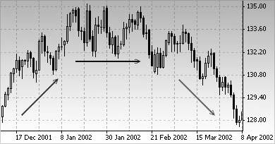
Pic. 4.1 d. On the left side of the graph we can see the growing trend representation, on the top – a flat-dipping line and decreasing movement on the right.
A trend has three directions
It is no coincidence that we have introduced the following concepts: ascending, descending and flat moving trends. A great many of people suppose that the market follows one certain line – increasing or decreasing. But in actual fact, the market moves in three directions: up, down or remains in a holding pattern. This must be well-learned, as according to the conservative estimates, about one third of all time is spent on bottom-up adjustments when the peaks and recessions stay approximately in the same range. This model of horizontal price movement is called “trading or market range”. Such vibrations show the equilibrium price period when the supply and demand ratio is almost changeless. For a technical analyst this kind of market turns out to be a trap.
Most technical instruments and systems are oriented to the tendency, in other words, they are focused on how the market moves – upwards or downwards. In a trendless mode they become inefficient or out of work at all. Especially these “sticky” periods of a flat market bring a lot of disappointments for the technical system traders, resulting to significant losses. For efficiency of the trend following system, first of all there must be a trend. So the seat of the trouble is not in system, but in the trader trying to use it under the conditions not suitable for this system. Each trader, operating in the financial market, has three options: buy (take up a long term position), sell (short term position) or do nothing (wait). If the market goes up, it’s better to buy. If down – sell.
But if the market is flat, trendless, the most reasonable decision would be not to undertake anything.
Three trend types
In addition to that a tendency can follow three scenarios mentioned above, it can also come in three forms: the long-term, mid-term and short-term (or small). Actually, the quantity of trends operating and crossing each others is almost endless. There are some trends able to exist just a few minutes, as well as those which can last several hours, but there are also supergiants – the existence period can continue 50 or even 100 years. However, the most chartists are inclined to the traditional classification and distinguish three tendency types, although, one term does not include the same concepts.
For instance, the Dow Theory determines the main trend as existing after 1 year. But, due to that the traders operate with much more shorter time lines, the main market trend is that which holds on not less than half a year. According to the Dow’s definition, a mid-term tendency lasts from 3 weeks to 3 months. And a small or short-term trend – more than 2-3 weeks.
Each type appears to be a part of another one, larger trend. For example, a mid-term tendency represents a correction or adjustment against the larger one. Amid a long-term rising trend the market can switch to a holding pattern to adjust the situation during a couple of months. This mid-term correction in its turn will involve a range of shorter rises and falls. And all this goes around and around. A tendency is some kind of a nested doll (Matryoshka), on one hand, it is a part of another larger trend, but it also contains some small elements (see the pic. 4.2 a and b).
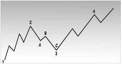
Pic.4.2 a Example of three tendency types: long-term, mid-term and short-term. Points 1, 2, 3 and 4 signal the long-term ascending trend. The wave 2-3 represents a mid-term correction within the long term one. In its turn, each mid-term (secondary) wave divides into smaller short-term trends. For example, the mid-term wave 2-3 consists of smaller waves А-В-С.
At the pic.4.2 a the long term tendency is up-directed, as the highs and lows are rising (points 1, 2, 3, 4). Correction phase (section 2-3) is a mid-term adjustment of the long-term rising trend. But pay attention to that the wave 2-3 divides into 3 smaller waves (А, В и С). At the point C an analyst can conclude that the long-term tendency continues going up, however, the mid-term and small trends are descending at this time. At the point 4 all three tendencies will be ascending. It’s necessary to get clear the difference between three trend types. In case, somebody asks which is the current market tendency, it’s essential to find out which one he bears in mind before answering. Most likely that answering this question you will have to apply to above mentioned classification and describe each of the three tendencies operating in the market at that time. As a rule, the most analytical approaches, acting amid the trends of the financial markets, are mostly oriented to the mid-term tendency, which can last several months. Small or short-term trends are usually used for defining a certain moment of opening or closing the positions. Let us say, if the mid-term tendency ticks up, the short-term drop can be used for taking a long position. If however, the mid-term tendency goes down the short-term jump can be useful for taking a short position.
Earlier, we frequently noticed that a price movement is a range of surges and slashes, and their direction determines the market trend. Now, let us entitle these upward and downward movements. Thus, there will be the concepts of “support” and “resistance”. The previous decline levels are called support. As it comes out from the book name, support – is a level or zone at the graph below the market rate, where the purchase ambition is rather high and can stand against the dealer’s pressure. As a consequence, the pace of decrease is slower and the prices are rising up again.
Ordinary, the support level can be defined in advance analyzing the previous drop. At the picture 4.3а the points 2 and 4 are in line with the support levels amid the ascending trend (see the pic. 4.3а and b).
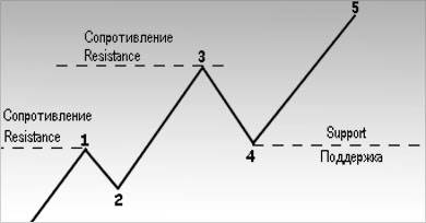
Pic. 4.3a. At the graph is depicted the support and resistance levels growing amid the rising tendency. The points 2 and 4 – are the support levels, usually, they match together with the previous downturns. The points 1 and 3 – are the resistance levels, which used to come in line with the preceding peaks.
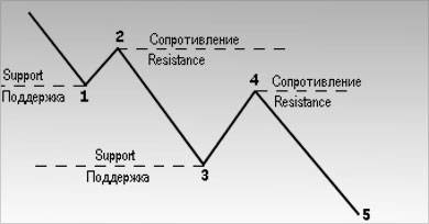
Pic.4.3b Resistance and support under the descending trend.
Resistance – is the opposite of support, above market rate level, where the sellers’ pressure overbears the buyers’ one. In consequence, the price growth eases and interchanges to a decrease. Usually, the resistance level comes in line with the previous top. At the pic. 4.3а the points 1 and 3 fit with the resistance levels. Here is illustrated the ascending trend chat, where the support and resistance levels are rising.
Pic.4.3b shows the down-going tendency graph, where the rises and falls are down-directed. In this case, the points 1 and 3 turn out to be the support levels, 2 and 4 – the resistance levels.
If the tendency moves up, the resistance levels signal the intervals during the development period, at a certain stage it is possible to overcome these levels and advance further.
If the tendency goes down, the support levels can not stop the price lowering, but it is able to hold it for a while.
To understand the core of the “tendency” concept it is essential to puzzle out the support and resistance terms. To say that the rising trend continues it is necessary each sequent recession (support level) to be higher than the previous one. Consequently, each next peak (resistance level) must be higher too. If a correction drop touches the previous rate, it may be the first sign of possible ascending trend finish or switch from a rising tendency to a flat one. If the prices manage to surmount the support levels, the changeover from ascending to descending movement becomes most probable.
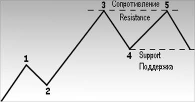
Pic.4.4a Example of reversal in the tendency dynamics. In the point 5 the prices did not overcome the previous maximum 3, and moved lower the preceding decline 4. This signals a changeover to a downside trend. Such kind of model is called “double top”.
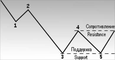
Pic.4.4b Example of a downward trend reversal. Usually, the first sign of that the prices have reached their bottom limit appears to be their ability to fix in the point 5 above the previous fall rate 3. The next price outbreak above the top 4 confirms the descending trend closing.
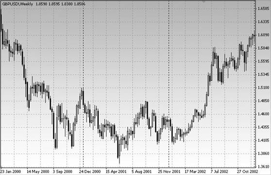
Pic.4.4 c Classical example of a down-going trend reversal. Try to memorize this picture, because we will return to it in the next lecture while studying the price models.
Each time the preceding resistance peak goes through testing, its outcome can turn out to be a verdict or diagnosis for the upside trend. If the prices are not able to overbear the last spike amid the rising motion or the last low on the downside, it may be concluded that the current trend adjustment will take place soon. In the next lecture concerned with the price models we will demonstrate how after retest of support and resistance levels at the chats appear the certain configurations signaling about the tendency reversal or about a break in its movement.
At the pic.4.4 a-c illustrated the classical examples of reversal in the trend dynamics. Pay attention that at the graph, at the pic.4.4a in the point 5 the prices did not manage to overcome the previous spike 3 and then fell below the last drop (point 4). In this case, the reversal in the trend dynamics can be determined by monitoring the support and resistance levels.
How the support and resistance levels vary the roles
Up to now a term “support” used to mean the previous low and “resistance” – the previous high. However, it’s not always like that. We have approached to one of the most interesting and least known aspects of support and resistance, consisting in that they can change the roles with each others. Each time when the support or resistance outbreaks significantly, they vary the roles – that is to say, they turn out to be an opposition of themselves. In other words, the resistance level becomes the support and inversely. To conceive this transformation mechanism we have to apply to the elements creating the support and resistance levels, to the psychological aspect of these concepts.
Psychology of support and resistance
For more demonstrativeness let us classify all the market participants into three categories: those, who take the long positions, who take the short positions and so called “unjoined”. The long positions take those who had already bought. “Unjoined” – the traders, who had left the market closing all the positions or those who had not decided yet how to enter the market and which side to take up.
So, let us imagine that somewhile, the prices were wobbling around the support range, then the market began to advance upwards. The part of “long” players, those who bought at support level prices, are exulting but regretting at the same time that they did not buy more. Say, good, but it is not enough. If the market could follow the previous support level and slip a little bit lower, they could buy much more. The part of “short” players recognized at last (or beginning to recognize) that their tactics was wrong (the extent of their pessimism is directly proportional to how far is the market from the support level, we will return to this later). The most desirable for them is the market to go down to the level, at which they took the short position, in order to leave the market exactly at that point where they entered (this is a so called breakeven point).
Those who are in the “holding pattern” can be also divided into two groups: the first group traders did not take any positions, others closed their long positions in the support level zone. The last-mentioned kick themselves now, because they rushed with the sale and looking for a chance to open the long positions at the selling price.
And what about those who could not make their choice regarding which side to take. They already understood that the prices spiked up following the upside trend. Thus, all 4 groups of the market participants firmly intend to buy in the time of nearest recession. For all of them the support level below the market rate is a “priority №1”. So, needless to say that, if the prices spike down to that level – a recovered stampede striving to buy would boost the prices again and they would run upwards.
The more high is the trading activity in the support range, the more essential becomes this area, as more participants are materially interested in it. The trading activity level can be defined in the support or resistance zone by three methods: according to the timeframe during which the prices were in that range, to the trading volume and the existence time of this area.
The more long is the time period within which the prices were fluctuating around the support and resistance, the more important becomes this band.
For example, if in a certain range of flatness, the prices were wobbling bottom-up during three weeks and then moved upwards, then this support band is more crucial in comparison with the similar fluctuations within a 3-day period.
One more relevance indicator of support and resistance is its time remoteness from the present moment. So far as we are dealing with the traders respond to the market behavior and the positions, which they had already taken or had not succeeded to do it yet, it is clear that the more soon will take place the event and reaction to it, the more notable would be this event by itself.
Now let us consider an opposite situation. Suppose that instead of going up, the prices slumped. In the previous example the prices were rising, so all the market participants began to buy during each correctional fall (setting up the new support levels). However, if the prices slide down and stay below the support rate, the respond of the market participants will change in a quite opposite way. All who was buying at the support rate clearly realize what a stupidity they have made. Finally, their brokers will frantically start requiring an additional collateral. Due to that in the dealing process appears so called “lever effect”, a trader can not blame itself for losses too long. He just has to increase the collateral or cancel the lossmaking position.
What was the example of the support level shaping? The purchase orders are below the market rate. And now all the previous purchase orders turned out to be the sale orders above the market rate. In such a way, the support evolved into the resistance. And, consequently, the more essential was the previous support level or the more close it was to the present moment and depending on the deals quantity, the more important will be the resistance level. All the factors which contributed the support level formation by the efforts of three categories market participants – “long players”, “short players” and “unjoined”, now will aim to set a top for the future surges and price rally.
After been overcome significantly the support level turns out to be a resistance and inversely. The pictures 4.5a-c are very similar to 4.3 a,b, except one detail. Pay attention, at the pic.4.5a in the rising trend process the action in the point 4 stops at the peak 1 or slightly higher. Thus, the previous resistance level (peak 1) turns into support, as the wave 3 overcame it significantly. All the sales of the wave 3 range (forming the resistance level) transform into the purchases below the market rate. The pic.4.5b show that the market prices drift down. The point 1 (the former support level below the market rate) becomes a resistance above the market rate, i.e. begins to play the role of a “price cap” (point 4).
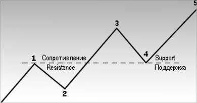
Pic.4.5a. Following the upturn trend, the resistance level changes into a support after been jumped over by a large amount. Pay attention to that when the resistance had been exceeded in the point 1, it turned into a support. The preceding highs act a part of support amid the next corrections.
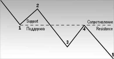
Pic.4.5b. Following the downturn trend the support level, after its break through, transforms into resistance for the future price pickups. Bring to notice the way how the previous support (point 1) becomes a resistance (point 4).
As it was noticed earlier, the prices move size from the resistance or support increases these levels’ value. Especially, when the prices overbear the support or resistance, and they change the roles with each others. For example, we discussed that they do it only in case the prices overcome this range by a significant extent. But what exactly should be considered as a “significant” extent? In this case, the estimate will be rather subjective. As a significance test the most analysts use the 10% price outbreak, particularly, for the support and resistance of the main tendency. If the question is in the support and resistance of shorter trend, then the outbreak size is required to lower to 3-5 %. Practically, each analyst must decide what exactly he will consider as a significant outbreak amount.
Therein it is necessary to remember that support and resistance exchange their roles only in case the market adjustments are rather significant so that the players could assure themselves that they have made a mistake, the more far moves the market, the more clear they realize their slippage.
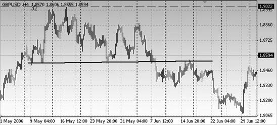
Pic. 4.5c Pay attention how the support which was laying off the market all May becomes a resistance barrier in June. Support turns into resistance.
Trend lines
Now when we have puzzled out the support and resistance, it is time to include in our technical instruments arsenal one more element – a trend line (see the pic.4.6a,c).
The main trend line represents one of the most simple technical instruments used in the graphical analysis. But despite its simplicity, it is an extremely valuable item for the futures market analysts. Rising trend line – is a right line traced out upwards from left to right through the sequent rising fall points. At the pic.4.6a it is depicted as a continuous straight line.
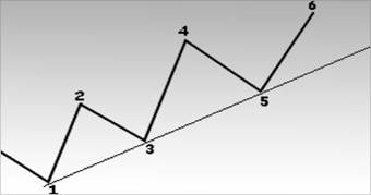
Pic.4.6a Example of rising trend line. Rising trend line is depicted under sequent rising fall points. Therein, a trial trend line may be traced through two fall points, one of which is higher (points 1 and 3), but for this line validity confirmation, the third line is required (point 5).
Downward trend line is traced down from left to right and passes through sequent lowering peaks (see the pic.4.6b).
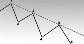
Pic.4.6b. Downward trend line is traced above sequent descending peaks. An experiential trend line can be constructed with two points (1 and 3), but it will be considered as veridical after there will be three such points (point 5).
Trend line construction
As any aspect of graphical analysis, a trend line designing – is some kind of a skill. Usually, to trace out the right line you have to practise a little bit and construct it several times. Here are some handy tips to find out the right line. First of all, there must be trend occurrence signs. This means that to design an ascending trend line, at least 2 slumps are required, the second drop must be higher than the first one. Obviously, to build up the right line you will need two points. For instance, you can confidently say about upside trend at the pic.4.6a only after price dip will stop in the point 3 (higher fall), and the prices continue advancing.
Only after that is possible to trace out a sample trend line under the points 1 and 3. Some analysts prefer wait for the prices to overcome the peak 2 level in the next upturn period for the ascending trend affirmation, and then the line is constructed. Others are satisfied with that the upturn area touches the half of the 2-3 leg distance or reaches the peak 2 range. As it is seen, the criteria can be different, however, it is essential to remember one thing: each analyst wants to be sure that the intermediate price dip is over and he can mark the real downturn point. After two sequent fall points are marked at the graph, where the next going point is higher than the previous one, they are connected with a straight line traced out from left to right. For confirmation of the sample trend line validity the prices have to touch it for the third time, and starting out from there move upwards.
How to use the trend line
Let us say, we are dealing with the up-going tone. In this case, inevitable correctional or mid-term recessions will take on very closely to the upside trend line or be tangent to it. As amid the rising trend, a trader relies on buying at the declines, the trend line may serve as a support bound below the market rate, which can be used as a purchase zone. If the tone is down-going the trend line can be used as a resistance level for sale.
Currently, there is no reversal in the trend line dynamics, it can serve for purchase and sale zones determination. But in the point 9 at the pic.4.7a and 4.7b such reversal takes place. This signals that all the positions opened in the previous trend direction must be liquidated. Oftentimes, the trend line outbreak – is the first reversal signal in the tendency behavior.
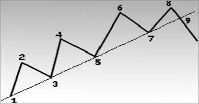
Pic.4.7a As soon as the rising trend line is set up, the next drops reaching the line can be useful as purchase ranges. The points 5 and 7 at this graph can serve for opening the new or additional long positions. The trend line outbreak in the point 9 proves the reversal in the trend behavior: probably, it moves downwards. That is why it is necessary to cancel all long positions in the point 9.
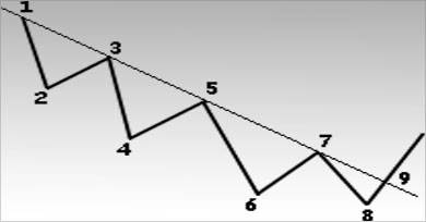
Pic. 4.7и Points 5 and 7 can be used as a sale zone. The trend line outbreak (point 9) signals about possible trend reversal increase.
How to determine the trend line meaningfulness?
Let us puzzle out some nuances of the trend line practical usage. Above all, you need to find out what defines this line significancy? The answer is dual: on one hand, the trend line meaningfulness depends on its validity period, on the other hand, how many times it was tested. If, for example, the trend line stands 8 tests, each of which has confirmed its validity, undoubtedly, it is more significant, than a line, which was touched by the price only three times. Aside from this, the line which was asserting its validity during 9 months, is much more important than that which existed about 9 weeks or days. The more high is the trend validity, the more reliable it is, as well as its outbreak.
How to deal with low-level outbreaks of trend lines?
Between times, during the day the prices break through the trend line, but by the closing moment everything resumes its natural course. So, that is a dilemma for analyst: if there was an outbreak? (see the pic.4.8). Is it necessary to trace out a new trend line in reference to new data, if a slight breakdown of the trend line was just short-gap or stochastic? At the pic.4.9 is demonstrated exactly this situation. Within the day the prices dipped below the upward trend line, but they turned out to be above it by the closing. Is the trend line needs to be designed again in this case?
Unfortunately, it is next to impossible to give a certain advice for all of life's emergencies. Sometimes, you may set aside such breakout, especially, if the further market movement approves the initial trend line validity. In some cases, a compromise is required, when an analyst traces a new sampling trend line which is designed as a dotted line in addition to the first one (see the pic.4.8). In this case, two lines at once are at the analyst’s disposal: original (solid) and the new one (dotted). As a rule, the experience shows that if the trend line outbreak is relatively insignificant and takes place within one day, and by the closing moment the prices level off and reach the reading above the trend line, then the analyst can neglect this blowout and continue using the initial trend line.
As in many other market analysis fields, here it is better to rely on experience and intuition. In such disputable points – they will be your best advisors.
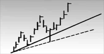
Pic. 4.8 Sometimes, the trend line runout within one day makes a dilemma for the analyst: if to keep the initial trend line, which is still valid or to trace out a new one?A compromise would-be, amid which the first trend line remains, but at the graph the new line is designed as a dotted one. Time will show which is the most correct.
The trend lines reshape themselves
It was mentioned earlier that after a break through the support and resistance change into their opposite. The same is with the trend lines (see the pic.4.9 a-c). In other words, the up-going trend line (support line) turns into a resistance after substantial breakout. The downside trend line (resistance line) in its turn may become a support after runout. That is why, at the graphs it is strongly recommended to prolong all the trend lines from left to right as much as possible, even if they are overcome. It is amazing how the old trend lines appear as the support or resistance lines in future, but already as the opposite items.

Pic. 4.9a Sample of how the up-going support line becomes a resistance. Usually, the support line turns into a barrier resistance for future spikes after a clear break down.

Pic.4.9b More often than not, the descending trend line becomes a support after a tick up.
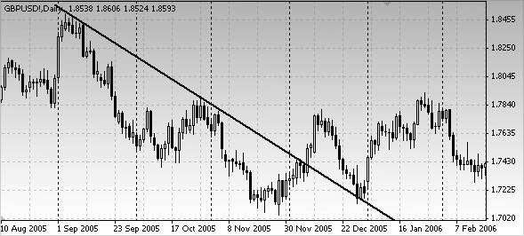
Pic.4.9c Pay attention that the most downside trend line becomes a support after a break out and upward reversal.
How to correct the trend lines?
From time to time, the trend lines need to be corrected in accordance with the trend improvement pace adjustments: if it goes faster or slower (see the pic.4.10 and 4.11). Take our previous example: if the trend line is overborne it is necessary to trace out a new one, flatter. If, vice-versa, the line is too flat – it is necessary to redraw it under steeper slope. The pic.4.10 displays the situation, amid which a break through of abrupt trend line (line 1) led to the necessity to shape up a new flatter line (line 2). At the pic.4.11, on the contrary, the primal trend line is very flat (line 1), so a new one has to be depicted under steeper slope (line 2). The rising trend pace accelerated, demanding for more rapid trend line. A trend line, which is too far from the real price movement configuration in the market, has no value for the tendency analysis.
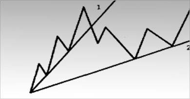
Pic.4.10 Example of a sharp trend line. The initial upside trend line turned out to be extremely rapid. Often, a break through of such line is just a switch to more moderate and, consequently, more “sustainable” rising trend pace.
If we are dealing with the accelerating tendency, at the graph may emerge several trend lines with steady growing inclination angle. In such cases some analysts use bent trend lines. However, as a matter of experience, it is known that if there arises a necessity in sharper trend lines, it is better to switch to another instrument – moving average, which represents itself a curvilineal trend line.
The advantage of access to different technical indicators is that you are always able to choose the most suitable one for that certain situation. All methods of the technical analysis can work better or worse depending on the conditions. If a technical analyst has a total toolbar he will select the most effective and useful instrument for a certain moment. A tendency of advancing development pace – is that occasion when the moving average is more convenient than a range of trend lines with bigger angle of slope.
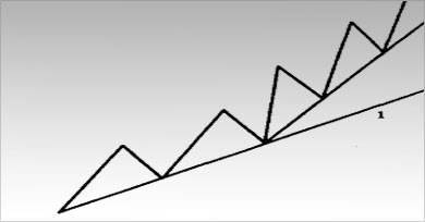
Pic. 4. 11 Example of too flat upcast trend line (line 1). Line 1 happened to be extremely flat or slow, while the improvement pace quickened. In this case you need to trace out a new sharper trend line, which would be more corresponding to the advancing tendency.
The channel line
A channel line or return line can serve as one more example of trend line employment. Sometimes the prices fluctuate in the ranges, bounded by two parallel lines: the main trend line and channel line. Of course, if the technical analyst manages to discern a similar channel occurrence, he will turn to advantage this information.
The trend line construction doesn’t represent an extra complexity. If we have to do with the rising trend (see the pic.4.12a), above all it is needful to design the main growing trend line. It will pass through the fall points. Afterwards, we depict the dotted line, which is parallel to the major increasing trend line. The dashed line gets through the first significant top point (point 2). The both lines go bottom-up from left to right forming a channel. If during the next upturn the prices touch the channel line and jumping from it, decrease again, that means that the channel possibly exists (point 4). If during a decline the prices dip to the origin trend line level (point 5), the probability of channel occurrence increases. All said earlier can be referred to the descending motion (see the pic.4.12 b), but certainly quite opposite.
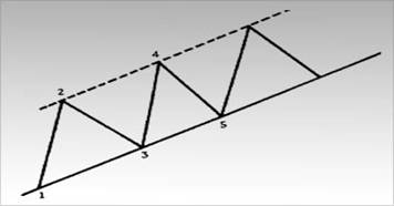
Pic.4.12a Example of a trend channel. After at the graph will be depicted the main mounting trend line (through the points 1 and 3), you may map the channel line or the reversal line (dashed line). It will stretch in parallel to the major growing trend line through the first peak point 2.
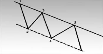
Pic.4.12b Trend channel in the course of descending movement. The channel line isprojected down and passes through the first drop point (point 2) along with the down moving trend line marked out through the spike points 1 and 3. The price fluctuations often take place within a similar trend line.
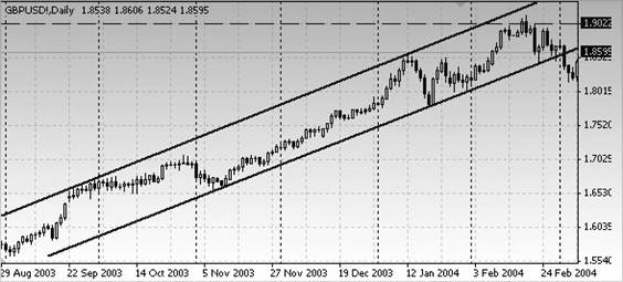
Pic. 4.12c Draw attention to the way how the up-directed motion fits well between the parallel trend lines. The main upward trend lines (bottom lines) are always more essential. Nevertheless, the channel lines in the headward course can help to determine the upper resistance bound.
The main up-going trend line may be useful for the long positions opening. The channel line can serve as an orientation point to make profit within the short term operations. The traders, inclined to risk, can use the channel line to open the short positions in direction, opposite to the main tendency, although playing against a dominative trend is always dangerous and, as a rule, unprofitable.
As well as in a case with the key trend line, the longer stands the channel and the more there are checking points, the more essential and reliable becomes this channel.
The main trend line outbreak is always a reversal approval in the tendency behavior. However, the ascending trend line outbreak has exactly the opposite reading and shows the precipitation of existing tendency dynamics. A great many of traders consider the upper bound break through during the upward trend as a signal to open additional long positions.
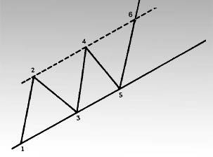
Pic.4.12d Break through of the rising trend line in the point 6.
The channel can be helpful for the tendency strength estimation. If the fluctuations don’t reach the channel line bounds - that means that the movement is down-directed. At the pic.4.13 it can be seen that at the moment when the prices did not manage to touch the top channel edge (point 5), a trader can draw conclusion about coming breakup of the tendency. For the time being, it’s just a caution, but as likely as not, that the second line (the base up-going trend line) will be also broken through. The practice shows that if the price adjustments within the certain channel did not succeed to reach one of its bounds, then this is a frank characteristic of the trend behavior changing, approving that apparently, a break through of the opposite channel bound won’t be long in coming.
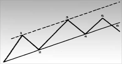
Pic.4.13 If the price adjustments can not reach the upper channel bound – this is the first sign of that the bottom edge will be digged through soon. Pay attention to that after a failed effort to increase to the upper bound level (point 5) follows a break through of the main upside trend line (point 6).
The channel can serve for the base trend line correction (see the pic.4.14 and 4.15). If the prices outstep significantly from the upper channel boundary it signals that the motion strengthens. Thereat, most analysts trace out a steeper rising trend line. It is stretched from the last fall upwards, in parallel to the new channel line (see the pic.4.14). Frequently, a sharper support line is more efficient in practical work, than the old one, which is flatter. The same can be concluded regarding the reversed situation. Let us assume that within the upside trend the spike could not climb to the upper channel edge. That means that you have to design a new support line from the last drop point, in parallel to the new resistance line, which connects two last upticks (see the pic.4.15).
The channel lines also serve the purpose of price targets determination. After a stepout from the existing price channel, as a rule, the prices pass a distance equal to the channel width. Thus, the user just has to measure the channel width and then project this size from the point of any trend line break through.
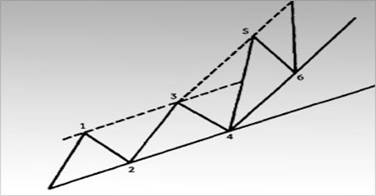
Pic.4.14 After a break through of the upper channel boundary (wave 5) the most analysts shape up a new growing trend line, paralleled to the new top channel line. Put it differently, the line 4-6 is traced out in parallel to the line 3-5. As the upward direction dynamics gathers its pace, small wonder that the main upside trend line is to be sharper.
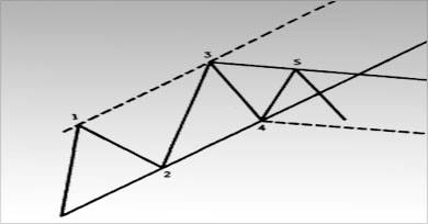
Pic.4.15 If the prices do not manage to amount to the upper channel bound and the descending trend line is traced through two sequent down-going peaks (line 3-5), then it is possible to construct a probationary channel line. It will take its rise from the fall point 4 alongside with the lines 3-5. At times, this ground channel line is employed as an initial support level for the new tendency.
Though, it must be borne in mind that among these two lines, the main trend line is always the most essential and reliable one. Compared to it the channel line plays a small part. Despite this fact, the channel line usage can often be rather effective, and it is worth including it to the toolbar of the technical analyst.
Test questions:
1.What are the parameters for determination the descending and ascending trends?
2. How is constructed the trend line within the downward movement?
3.What are the resistance and support lines?
4.What happens with the resistance level after its break through?
5.Find out at the graph the rising trend and put the trend line. Send the graph screenshot.
6.Which price extremums link while tracing out the up-going trend line?
7.What line is called a channel line?
8.What event serves as a signal for opening the additional long and short positions?
 English
  Arabic